Experience Better UX Design
Product Designer? Visual or Digital Designer?Graphic Designer? UI Designer? Whatever the need….
Experience Better UX Design
Product Designer? Visual or Digital Designer?Graphic Designer? UI Designer? Whatever the need….


For Business
Let's Discuss How I Can Help!
Questions & answers to give you a sense of my process, my methodology.
How do you approach user research, and can you give an example?
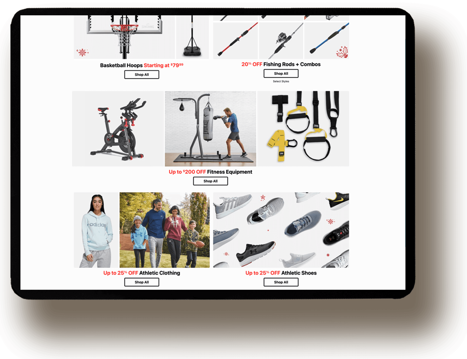
My research approach combines quantitative and qualitative methods to create a comprehensive understanding of the user. At Academy Sports + Outdoors, I paired browse path analytics and search query data with card sorting sessions across a cross-section of real customers. The quantitative data showed where users were dropping off; the qualitative sessions revealed why — customers thought in terms of activity and season, not the department structure the business had built around. That reframe became the foundation of the entire IA redesign, and the restructured navigation contributed to record Christmas e-commerce performance in its first season live.
Tell me about a time when your initial design didn't work. How did you iterate?
My first approach to EatNeat's core interaction was traditional meal logging — structured input, daily targets, progress tracked against a plan. Early testing sessions told a different story. Users weren't abandoning the app because the logging was hard, they were abandoning it because it felt like a report card. Every missed entry was a visible failure. The compliance framing was creating the exact anxiety the product was supposed to reduce. I scrapped the logging model entirely and rebuilt around meal swapping instead — rather than tracking what users ate, the system suggests contextually appropriate alternatives when users want to deviate. That shift from compliance to conversation changed how users felt about the product. Swap-based interactions tested significantly better across the board, with users citing lower anxiety and a stronger sense of agency over their health decisions.
How do you balance business goals with user needs?
The most useful reframe I've found is that conflicting business and user goals are usually a signal that the design problem hasn't been defined correctly yet. FinanceFlow is a good example — the business needed deeper platform engagement, but users came in anxious about money and wanted to spend as little time as possible dealing with it. Those look like opposing forces until you realize that reducing the cognitive burden of financial management is exactly what earns the trust that drives engagement. I designed around progressive disclosure — users get the quick, actionable snapshot they need immediately, with deeper analytics available when they're ready for it. The result was stronger engagement and significantly less time spent on routine financial tasks. The lesson was that when user needs and business goals appear to conflict, there's almost always a design decision that resolves the tension rather than just splitting the difference.
What's your process for measuring design success?
I try to establish both behavioral and business metrics before design begins, not after. At Academy Sports + Outdoors, success was defined upfront as improved browse-to-product conversion during peak traffic — specifically the Christmas season. We tracked drop-off rates across the redesigned navigation, zero-result search rates, and category page engagement before and after launch. The quantitative results validated the IA decisions, but the more meaningful signal came from the qualitative side — customers navigating by activity and season rather than fighting a department structure that didn't match their mental model. The record Christmas e-commerce performance that first season was the business outcome, but the design success was the architecture becoming invisible. When users stop noticing navigation, it's working.
Do you provide the final design files to clients?
Yes, you own everything. You'll receive fully organized Figma files, exported assets, component documentation, and a style guide — everything your development team needs to build from the designs accurately. For more complex systems I also include annotations covering interaction states, edge cases, and responsive behavior so nothing gets lost in handoff.
Let's Discuss How I Can Help!
Questions & answers to give you a sense of my process, my methodology.
How do you approach user research, and can you give an example?
My research approach combines quantitative and qualitative methods to create a comprehensive understanding of the user. At Academy Sports + Outdoors, I paired browse path analytics and search query data with card sorting sessions across a cross-section of real customers. The quantitative data showed where users were dropping off; the qualitative sessions revealed why — customers thought in terms of activity and season, not the department structure the business had built around. That reframe became the foundation of the entire IA redesign, and the restructured navigation contributed to record Christmas e-commerce performance in its first season live.
Tell me about a time when your initial design didn't work. How did you iterate?
My first approach to EatNeat's core interaction was traditional meal logging — structured input, daily targets, progress tracked against a plan. Early testing sessions told a different story. Users weren't abandoning the app because the logging was hard, they were abandoning it because it felt like a report card. Every missed entry was a visible failure. The compliance framing was creating the exact anxiety the product was supposed to reduce. I scrapped the logging model entirely and rebuilt around meal swapping instead — rather than tracking what users ate, the system suggests contextually appropriate alternatives when users want to deviate. That shift from compliance to conversation changed how users felt about the product. Swap-based interactions tested significantly better across the board, with users citing lower anxiety and a stronger sense of agency over their health decisions.
How do you balance business goals with user needs?
The most useful reframe I've found is that conflicting business and user goals are usually a signal that the design problem hasn't been defined correctly yet. FinanceFlow is a good example — the business needed deeper platform engagement, but users came in anxious about money and wanted to spend as little time as possible dealing with it. Those look like opposing forces until you realize that reducing the cognitive burden of financial management is exactly what earns the trust that drives engagement. I designed around progressive disclosure — users get the quick, actionable snapshot they need immediately, with deeper analytics available when they're ready for it. The result was stronger engagement and significantly less time spent on routine financial tasks. The lesson was that when user needs and business goals appear to conflict, there's almost always a design decision that resolves the tension rather than just splitting the difference.
What's your process for measuring design success?
I try to establish both behavioral and business metrics before design begins, not after. At Academy Sports + Outdoors, success was defined upfront as improved browse-to-product conversion during peak traffic — specifically the Christmas season. We tracked drop-off rates across the redesigned navigation, zero-result search rates, and category page engagement before and after launch. The quantitative results validated the IA decisions, but the more meaningful signal came from the qualitative side — customers navigating by activity and season rather than fighting a department structure that didn't match their mental model. The record Christmas e-commerce performance that first season was the business outcome, but the design success was the architecture becoming invisible. When users stop noticing navigation, it's working.
Do you provide the final design files to clients?
Yes, you own everything. You'll receive fully organized Figma files, exported assets, component documentation, and a style guide — everything your development team needs to build from the designs accurately. For more complex systems I also include annotations covering interaction states, edge cases, and responsive behavior so nothing gets lost in handoff.
Ready to see what 5+ years of proven UX impact can mean for your team?
Explore my projects and discover how strategic UX design and user research have helped businesses grow revenue.
Ready to see what 5+ years of proven UX impact can mean for your team?
Explore my projects and discover how strategic UX design and user research have helped businesses grow revenue.
Ready to see what 5+ years of proven UX impact can mean for your team?
Explore my projects and discover how strategic UX design and user research have helped businesses grow revenue.