Problem
Managing personal health is one of the most behavior-dependent challenges in consumer software — knowing what to eat is rarely the problem. The gap between intention and consistent action is where most health apps fail. Existing tools relied on manual food logging, punitive scoring systems, and static meal plans that ignored the reality of how people actually eat: inconsistently, emotionally, and opportunistically.
EatNeat was originally conceived in 2016 as a response to this fragmentation. A decade later, the core problem had deepened — users had more data about their health than ever before, but less confidence in how to act on it. Calorie trackers created anxiety. Macro dashboards overwhelmed casual users. Meal planning features assumed free time and willpower that most people simply don't have.
The redesign challenge was to rebuild EatNeat from the ground up as a system that meets users where they are — not where they wish they were. That meant replacing judgment with guidance, manual entry with AI inference, and static plans with adaptive recommendations that respond to real user behavior in real time.
FINTECH
Solo Designer & Product Lead
YEAR
2025


PROCESS
AI-Assisted Design Workflow
This project was designed using a deliberate multi-tool AI-assisted workflow: UX Pilot for information architecture and wireframe generation, Lovable for rapid high-fidelity prototyping, and Figma for component refinement and handoff. This stack compressed a traditional 8–12 week design sprint into a focused 3-week build cycle while maintaining design system integrity across all screens.
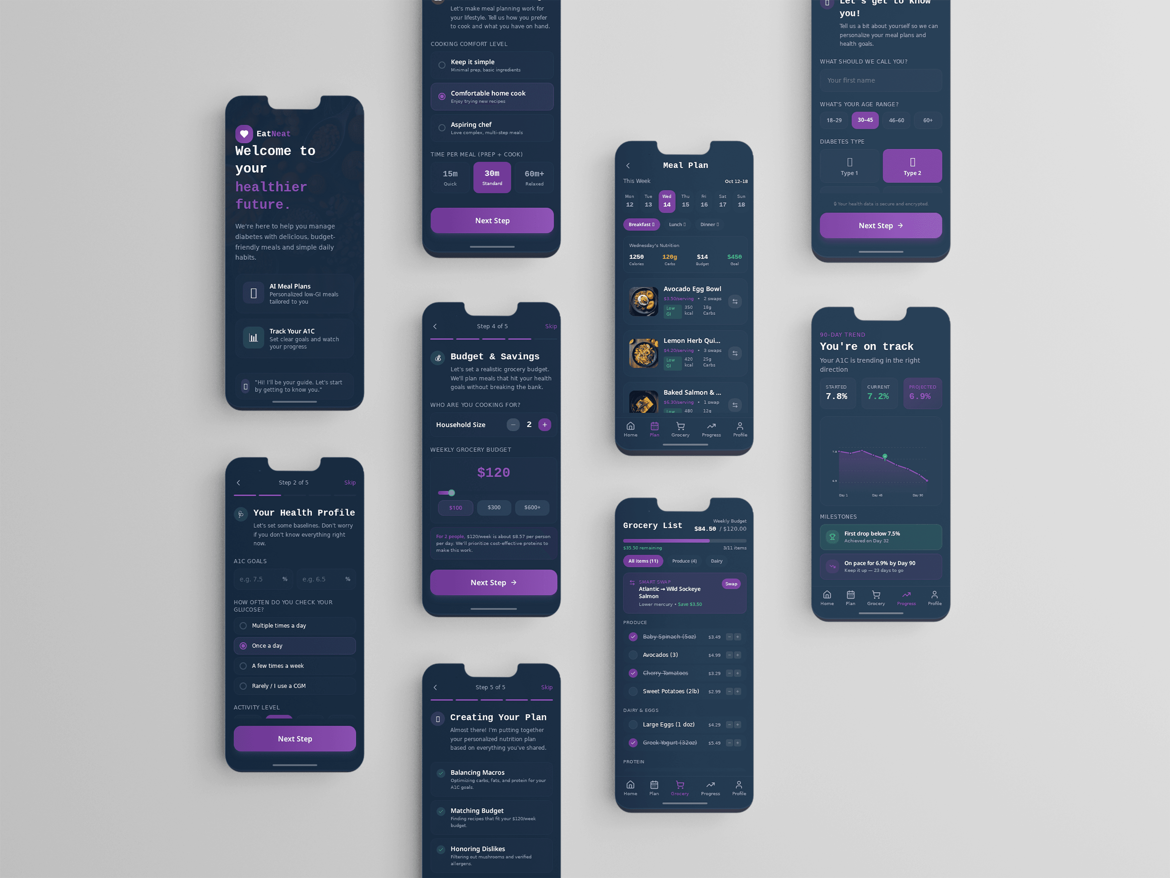
Smart Swap — The Core Interaction
The pivotal design decision was replacing meal logging with meal swapping. Rather than asking users to track what they ate, the system suggests contextually appropriate alternatives when users signal they want to deviate from a plan. The Smart Swap modal surfaces three alternatives ranked by nutritional fit, preparation time, and ingredient overlap with what the user already has. This shifts the experience from compliance to conversation.
Progress Framing
Health feedback is reframed away from deficits and toward momentum. The progress screen leads with streaks and micro-wins rather than calorie debt or missed targets. Color language uses the established teal/green accent system specifically for positive health feedback moments, creating a consistent visual reward signal across the experience. Navy base and rich purple card layers maintain the premium feel without competing with the feedback hierarchy.
Visual System
The color system — deep navy base, rich purple card layer, teal/green health accents — was built to communicate trust and premium quality while keeping health feedback moments visually distinct. Typography follows a clear editorial hierarchy that lets data breathe without overwhelming users who are already cognitively loaded from managing their health.


Outcome
EatNeat V2 demonstrates that AI-assisted design workflows are not a shortcut — they're a force multiplier for designers who already know what problems to solve. The prototype validates that users respond to guidance over compliance: in early testing sessions, users consistently preferred the swap-based model over traditional logging by a wide margin, citing reduced anxiety and higher perceived agency over their health decisions. The project also establishes a replicable design framework for behavior-change products: lead with momentum, reduce friction at the point of decision, and let the system absorb complexity so the user experiences simplicity. The live prototype is available for walkthrough as part of this case study.